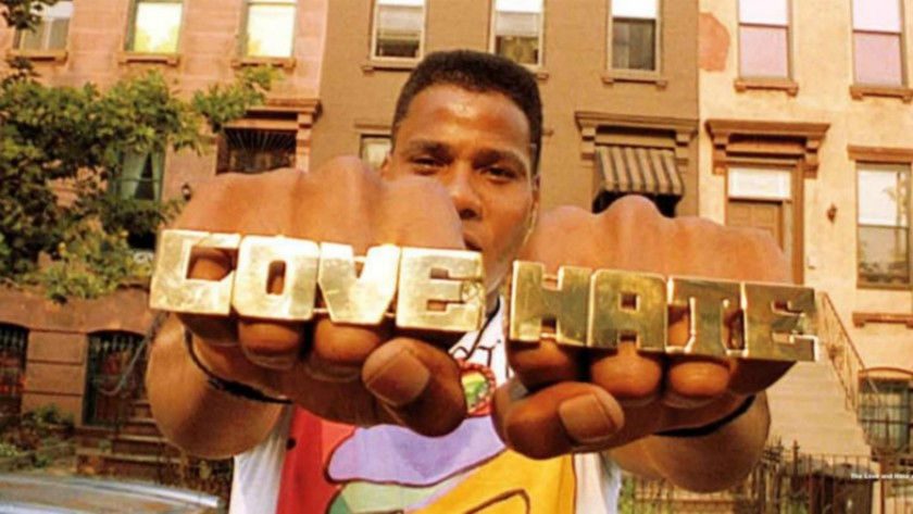
King of the Dutch Angle: Spike Lee and Do the Right Thing
- Avery Wayne
- Sep 6, 2021
- 2 min read
In Do the Right Thing, Spike Lee takes his signature form to a new level: brazen, bright, panoptic, vibrant, sexy shots populate the electrifying 1989 feature about the boycott of a Bed-Stuy pizza joint/racial tensions of the eighties.


Cinematographer Ernest Dickerson and costume designer Ruth Carter master the coloring, creating an easily discernible visual style of bright reds, purples, and oranges. Not only do the colors emphasize the sweltering setting (the hottest day of the year!!!! Recall those newspapers!!!!) they reflect the bright and varied Bed-Stuy community, each character with distinctive and eye-catching clothing. See Tina below, or Radio Raheem with his hand painted shirt, or the above Greek chorus of old men beside a cherry-red wall.


Carter says that she chose this costuming to emphasize the young, urban, Afro-centric identity of all of the characters, but also of Brooklyn (similar to Fresh Prince of Bel-Air, for example). Contrasting, bright colors and patterns define younger character’s clothing, while Sal and his henchmen merely wear wifebeaters and miscellaneous black work pants.

(These colors recall one of Spike Lee’s stylistic successors, Boots Riley. Below are shots from Sorry to Bother You.)


Dickerson also fabulously employs the Dutch angle, and the breaking of the fourth wall, using these devices as God intended to create a sinister, yet raw relationship between the viewer and the character in question (ex: Mookie, the main character played by Lee himself). These angles also support comparisons to a Greek tragedy: using low-angle shots for characters’ theatrical monologues imbues these sermons with a semi-religious reverence, giving respect to each individual character and their motivations.


Though the genius of the film is primarily in the nuanced, bold exploration of racially-motivated violence, Dickerson and Carter lend the film the incredible visual appeal that has defined Lee’s visual style and established Do the Right Thing as a major work in his filmography.

Коментарі